Paper
September 2020
MY JOURNEY IN PRINT AT SEGENSART
Over the last decades, print design is something that has been losing traction. Frequently being used as supplement to marketing campaigns, print design has slowed considerably. Add to that, book stores closing and going online, less people sending mail and writing in a physical medium, Segensart is in a tough spot. Designing cards and other paper products today means you have to believe in what you do. This is something that is happening at Segensart.
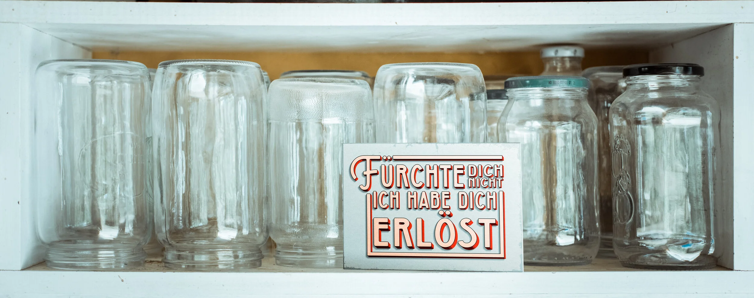

I started my time with Segensart in November 2017 speaking almost no German but that didn’t matter so much because it wasn’t about the words I could speak but the designs that I could produce. That is where I can honestly say that I was challenged in my style of design because what they were asking for was something that I wasn’t familiar with. Over the following years the Segensart design language changed as well as my own style, I learned a whole lot more German and I picked up a few other skills including being responsible for printing in-house. All that said here are a few of my thoughts and experiences from my time working as a graphic designer at Segensart.
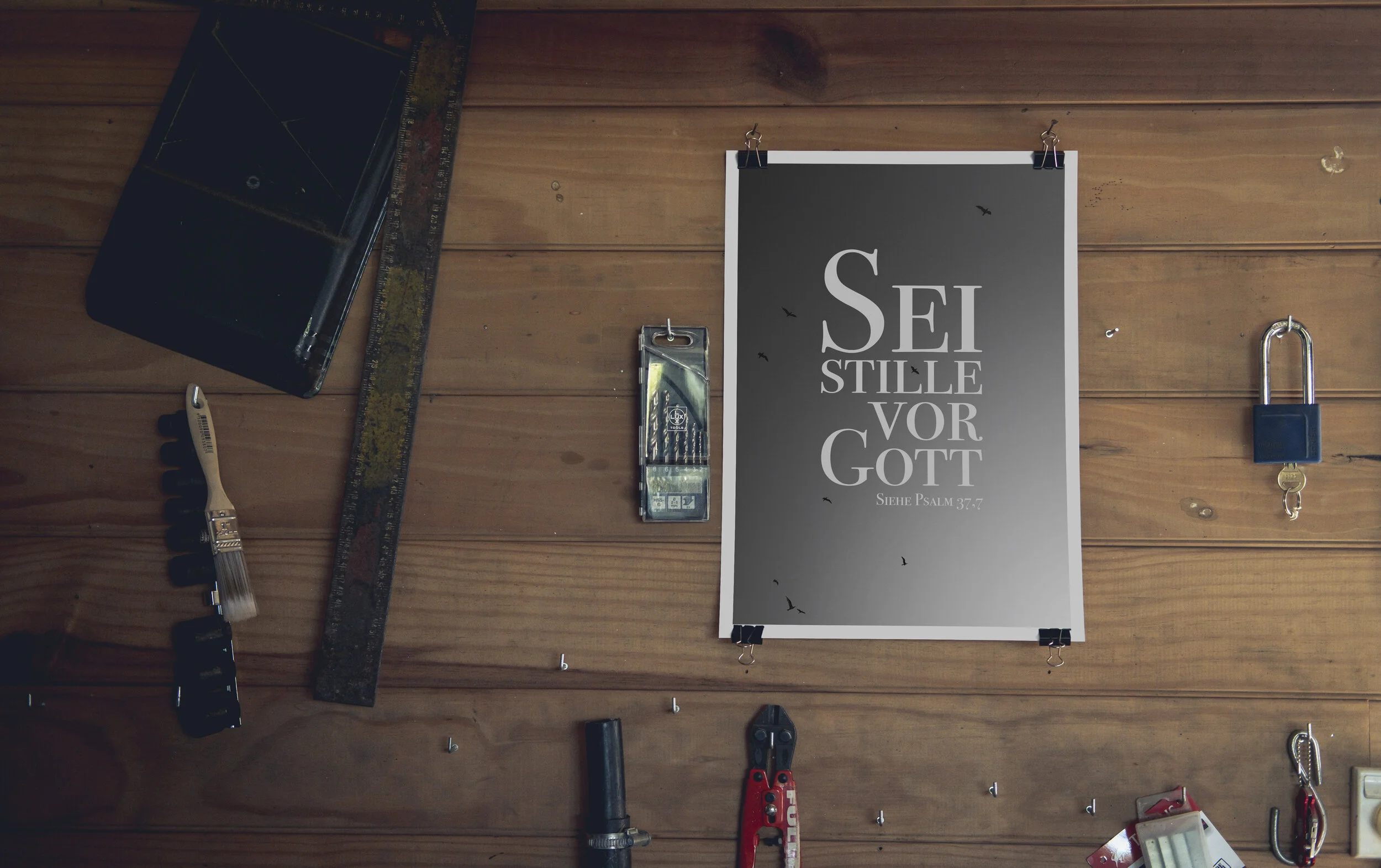
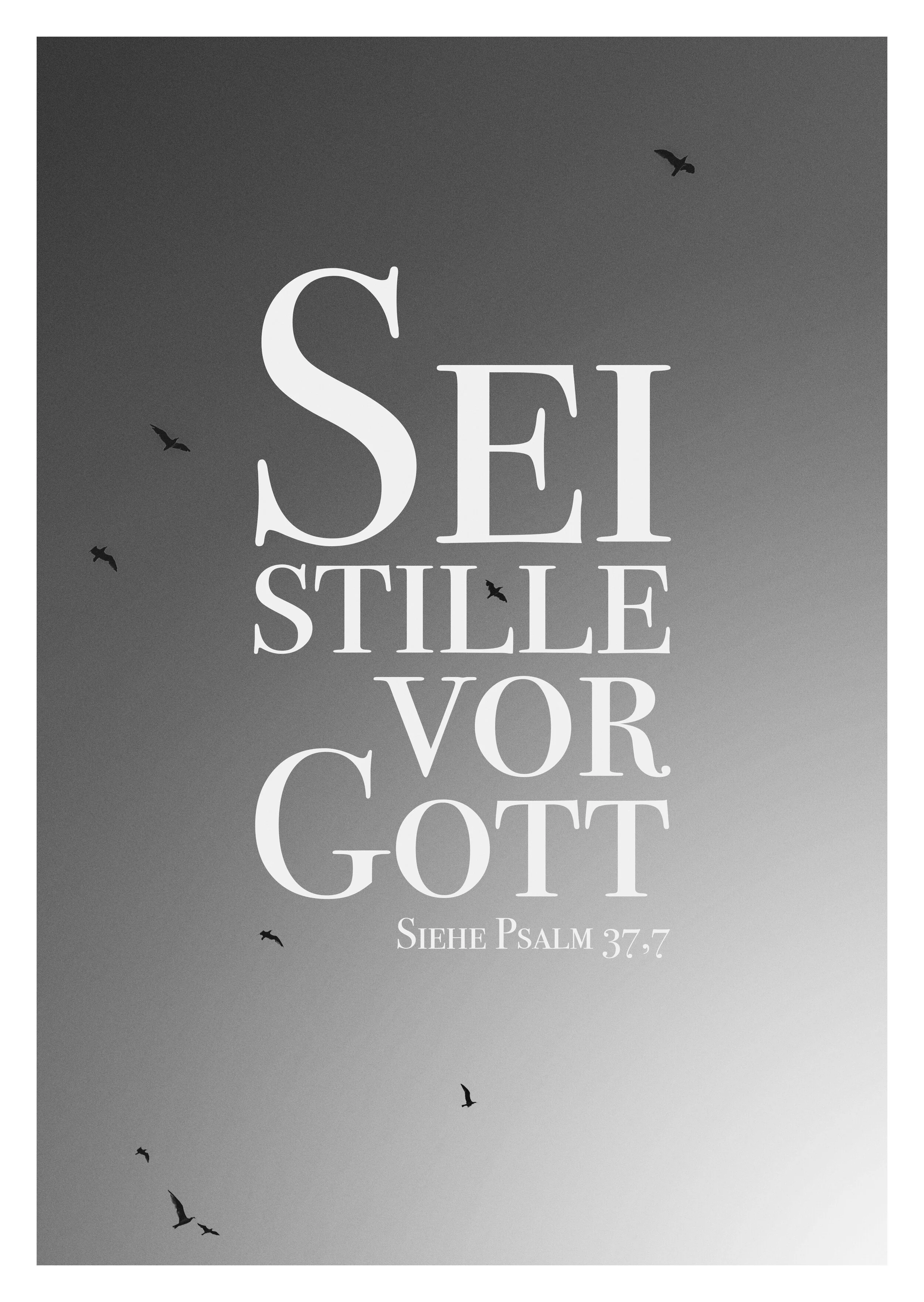
One of the greatest challenges was to believe in the designs that I produced. Because the designs that I designed were subject to review and criticism meant I had to follow up and push for getting the designs included when it came to production. This meant holding on the things that were important but also not being too proud that I couldn’t go back and change different aspects of a specific design. This really taught me to finish and be happy with what I made before moving on and if I didn’t get to that feeling then I had to let go and try something else.
Another aspect of print design that I needed to learn was how to take what I designed on the computer and make it look good in print. The biggest things that I think have an effect on this difference is screen size and the way that screens (vs paper) work with light. For screen size most of the time a print product is designed zoomed in or out and in the case of posters or bigger products its impossible to see a life size view on a screen. This is something that has to be taken into consideration. With light it needs to be remembered that screens emit light while paper reflects light. And for that reason lighter colours and whites will always look duller when printed.
During my time at Segensart I was able to witness a shift in focus. While previously there was a focus on quality however it was more about having the designs fit a certain style to suit a specific demographic. This was mainly driven to drive sales through third parties like book stores.
A shift to targeting the end customer meant the possibility for a wilder design language. The shift in design was not the only change that took place but also what products were produced, the way they were produced and the way they made their way to the end customers.
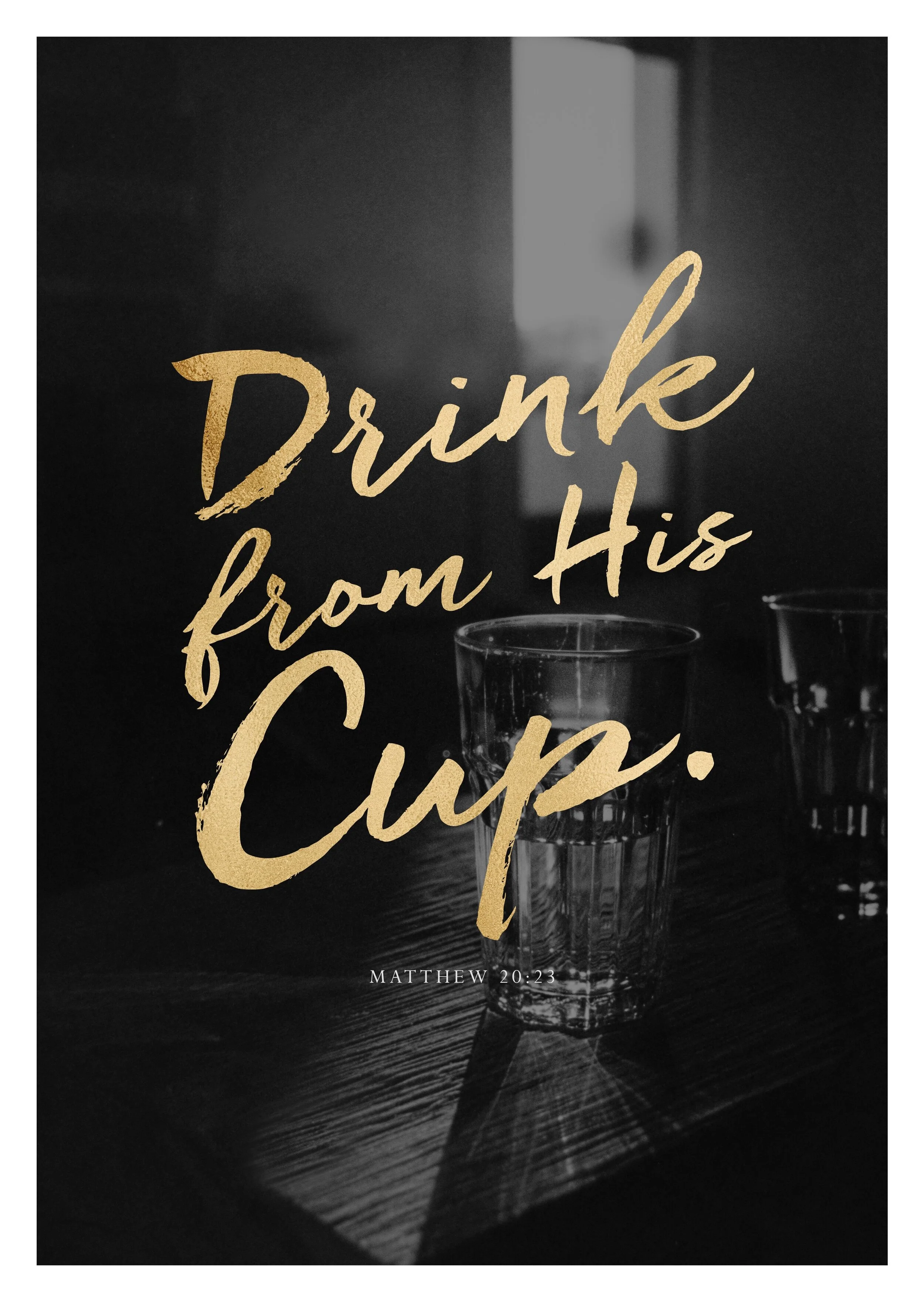
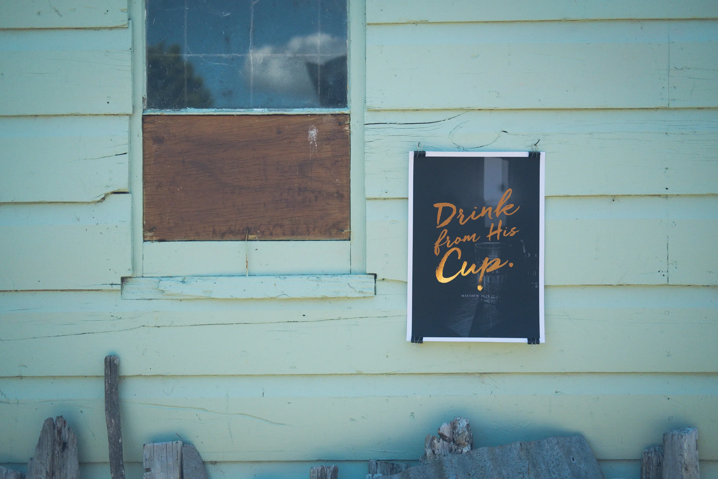
Take the posters for example. Nothing new was designed in the last years, the posters that were produced were just enlarged versions of postcards. Above all they did not reflect the best that could be made. In 2019 we started designing and producing posters once more. Designed to be posters, printed on high quality paper which was coated with a soft touch laminate and sold directly to end customers. These were products that showed what can and needs to be produced to be competitive today.
What comes next? With the current world situation being uncertain at best it means to continue to focus on quality throughout from design to delivery. This is something that I think Segensart does.